- arrow_back Home
- keyboard_arrow_right Affiliate Industry
Affiliate IndustryGetting StartedTips & Best Practices Admin February 15, 2024

How to Design Banner Ad Creatives for CPA offers
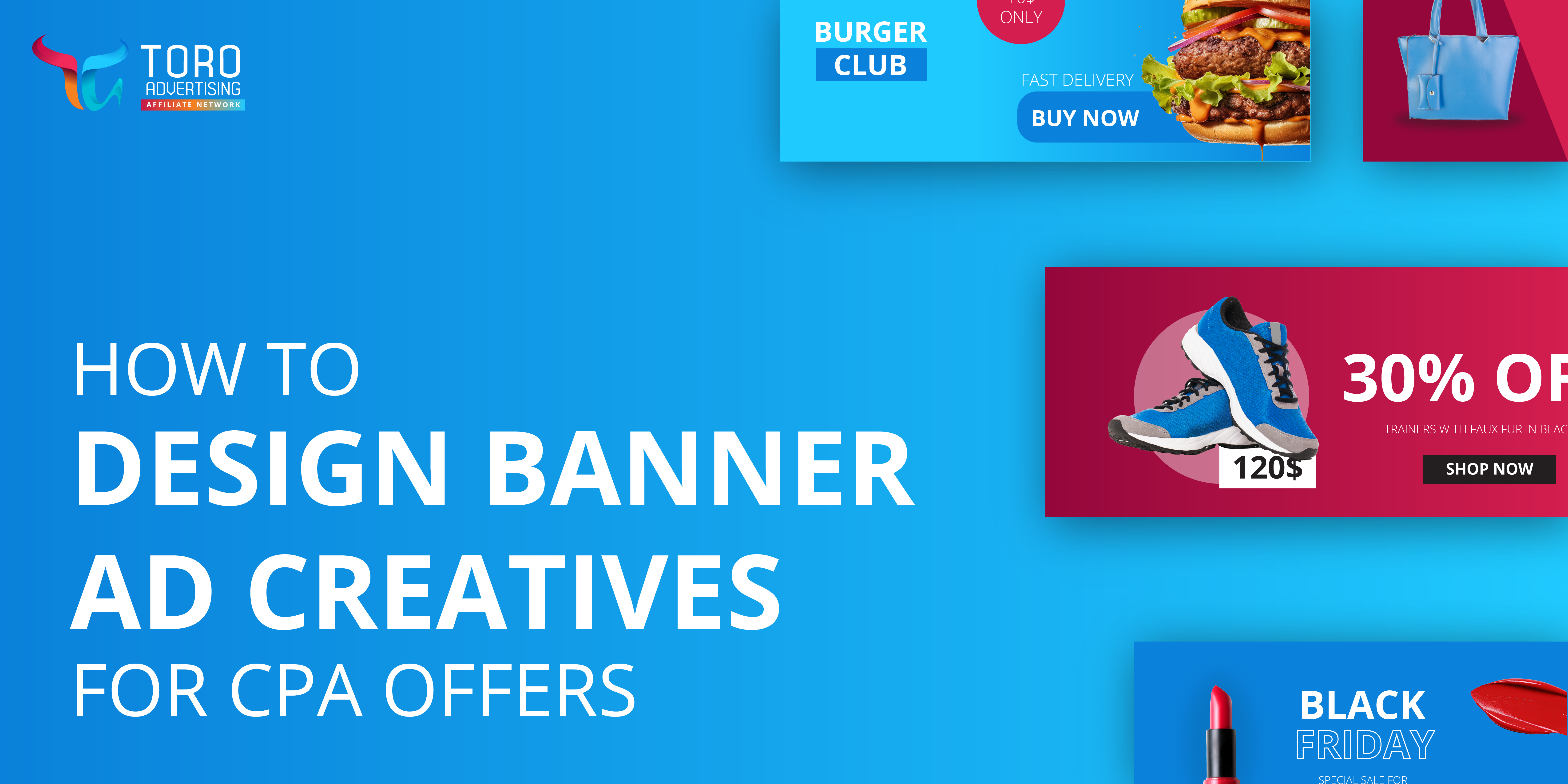
Calling all Affiliates! Are you wondering, how to design Banner Ad Creatives for CPA offers? Are you looking to increase your signups, downloads, or purchases on your CPA offers? Then try incorporating Banner Ads into your Affiliate campaigns. They are a great way to promote your CPA offers, because Banners are eye-catching and can be placed in high-visibility areas that can bring you higher conversions. They can be used on websites, blogs, social media and even video platforms and are highly adaptable for a variety of verticals. This article will help you create the most eye-catching Banners so you can get the highest possible revenue from your ads. We have also included some of the best Banner Ad design tips and tricks and how to create Affiliate Banner designs that convert.
How to create Affiliate Banners that Convert
Before we talk about creating great designs for your Banners it is crucial to ensure that we are producing high quality Ad content. In order to do this you will need to know how to create Affiliate Banner Designs that convert. So, let’s dive into the 6 ways to improve your Banner Ads and get higher conversions:
#1 Clear and compelling call-to-actions (CTAs): Banner Ads are highly effective in grabbing the customer’s attention. Make sure your Banner design includes a clear and persuasive CTA. Use action-oriented language like “sign up” or “download now”. Visually highlight the CTA button to attract attention and encourage users to click. You can experiment with different wording, colors, and placements to find the most effective combination for your Banners. A clear CTA can help attract new customers and retain existing customers.
#2 Simplify the message: Keep your Banner design and message simple and focused. Avoid cluttering the ad with excessive text or visuals that may distract or confuse users and clearly communicate the value proposition or key message in a concise way.
#3 Create personalized Banner ads: Customized display ads are 10 times more effective in generating clicks than standard display ads. Use compelling visuals that support the message and capture attention to boost credibility. Banners with a clear and simple message are more likely to convert your offers, establishing a strong connection with the end user and increasing your ROI. For example, if you have a dating offer and want to reach different categories of end users, let’s say you have a target of Gen Z, Millennials and Gen X. You can create different image creatives and messaging for your offer. Speak to each one in their language:
- Gen Z: They are young and looking for fun with a potential partner
- Millennials: This target loves emojis, so use them in place of text on your ad creative
- Gen X: They are older and therefore probably looking for a partner to grow old with
#4 Optimize for Mobile devices: According to Statista, Mobile devices accounted for 56.7% of online traffic worldwide in Q4 of 2023. With the increasing use of Mobile devices, it’s crucial to ensure your Banner designs are Mobile-friendly. Optimize the design for smaller screens, ensuring that the text is legible and the visuals are clear. Test the ad on your Mobile and adjust the design as needed to provide a seamless user experience. Most ad networks provide fully responsive ads, therefore your ad will automatically resize to look good on any device. Responsive Display Ads (RDAs) are a great option for Banner creatives, because they require just an image and text, and the ad networks system will automatically resize the creative to provide you with a wide range of different Banner sizes for you to test. Check out ad networks such as ExoClick which provides RDAs for advertisers.
#5 Banners are affordable and versatile: Banners can be displayed at a very low cost while being very attractive and eye-catching. They can be displayed in multiple ad zones creating a higher chance of reaching potential consumers with your offers.
#6 A/B testing: Conduct A/B testing to compare different versions of your Banner designs. Create multiple variations with slight differences in elements such as color schemes, layouts, or CTAs. You can test different channels and placements to determine the best mediums and placements for your Banners. Then analyze the performance metrics to identify the design that generates the highest conversion rates. We recommend continuously refining and developing your designs based on the insights gained from A/B testing.
Remember, these are ways to improve your Banner Ads and get higher conversions but optimization is an ongoing process. Continuously monitor and analyze the performance of your ads, gather user feedback, and make data-driven design decisions to continually improve your results.
How to design Banner Ad creatives for CPA offers
We have explored the ways to improve your Banner Ads and get higher conversions but we also need to think about design. In order to create great looking and professional standard Banner designs you should experiment with your use of color, font and, use high quality images. These elements can greatly impact your conversion rate. Here are some of the best Banner Ad design tips and tricks!
#1 Use color wisely
When designing Banner ads, it is crucial to use colors that align with your brand and convey the intended message. According to the psychology of color 92.6% of people say the visual dimension is the #1 influencing factor affecting their purchase decision. For example in the color of psychology Orange is seen as friendly, cheerful, and confident whereas blue is seen as trustful, dependable, and strong. The colors you choose can have an effect on your overall Banner campaign so choose wisely!
#2 Select the correct font
Select legible and bold fonts that represent your brand accurately. Have fun with the letter weights to create more visually appealing ads.
- If you are looking for a modern clean appearance Sans-serif fonts, such as Arial, Helvetica, and Open Sans could be a good fit for your campaign as they are easy to read, even at smaller sizes, and can convey a sense of professionalism and simplicity.
- Do you want to get your end users’ attention? Why not try Impact or Bebas Neue? These fonts are great for creating headlines or key messages they give a sense of urgency or importance In Banner Ads.
- For the body or longer text sections in your Banner ad, readability-focused fonts can be important. Fonts like Roboto, Lato, or Verdana are known for their readability, even at smaller sizes. These fonts ensure that the message is easily legible and comprehensible.
#3 Use high-quality images for your Banner Ad creatives
This might seem obvious, but many marketers are not aware of the importance of using high quality images or graphics to draw attention and engage your audience. Blurred or low visibility images will make the end users not trust your brand or ads leading to less conversions. We recommend that you identify the specific visuals you need for your Banner ads, such as product images, background images, or illustrations. Consider the dimensions and aspect ratios required for different ad platforms to ensure the images fit properly. Once you have selected high-quality images, it’s important to optimize them for web usage. Compress the images to reduce file size without compromising quality, as large file sizes can slow down the loading speed of your Banner ads. We also suggest that you use PNG or JPEG format, with a resolution of at least 1920×1080 pixels.
Conclusion: Best Banner ad design tips and tricks to get more clicks!
You have learned how to create Banner ads that convert and how to design Banner ad creatives for CPA offers. Now that you know the best ways to improve your Banner Ads and get higher conversions you should try them on your next Affiliate campaign! it is easier than ever to create your own campaigns with TORO Advertising’s professional advertising tools, exclusive verticals and advanced targeting tools. Our dedicated Account Managers will also be happy to help you on your Affiliate journey! So why not become a TORO Advertising Affiliate. Try out these tips and start creating Affiliate Banner designs that convert today!
About TORO Advertising
TORO Advertising has an exceptional knowledge of the industry and the experience necessary to help Publishers increase their income and to help Advertisers maximize exposure, awareness and sales.
Site Links

TORO Advertising is part of EXOGROUP, a group of companies dedicated to monesting the digital media space. We’re an international company offering a fun, fresh, and lively workplace in beautiful Tarragona (Spain) & Buenos Aires (Argentina).


